To create our film poster, I looked at other examples of existing horror film posters to generate ideas of what our film poster should aspire to resemble, and also to help me follow key conventions of a horror film poster. By looking at other film posters, my ideas developed because I incorporated different ideas from other posters to create my own to high standard,
Poster Influences
By taking conventions from other zombie horror film posters and adding it to our own, it helped us to develop and create a successful film poster. As we are comparing our own film poster to existing media texts, I've broken down what we used and how we developed it further, making it our own. Doing this effectively means that we fully understand the conventions and concepts of the zombie subgenre in terms of making a film poster.
Our Poster
Conventions We Used & Developed
A convention that we followed that developed our poster further was the image used in the background. The image is a still from some footage we obtained for the trailer, which happens to be an image of London that viewers/audience would recognize
Both 28 Weeks Later and The Zombie Diaries use this convention, which is where we got the idea from. We developed this convention further by making the image appear scratchy, old and worn on photoshop, also making it black and white so the main image can stand out more. This convention shows that because the threat may be in London, it's something thats of high importance, as London is one of the biggest cities in the world; showing that if it can happen in London, it can happen anywhere else - no one is safe,
Another key convention that we applied to the poster is the what the main image is and how it should look.
 |
| Our film poster's main image are bloodied hands, curling up into a fist to show the birth of the zombies. We took this convention from the American Zombie film poster and also the Cockneys vs Zombies film poster. We developed this by adding more hands to the image, instead of using a single fist; so that the image is made to appear stronger. We also developed this further by making the hands more diverse ethnically, to show how multicultural London had become. Examples can be seen below: |
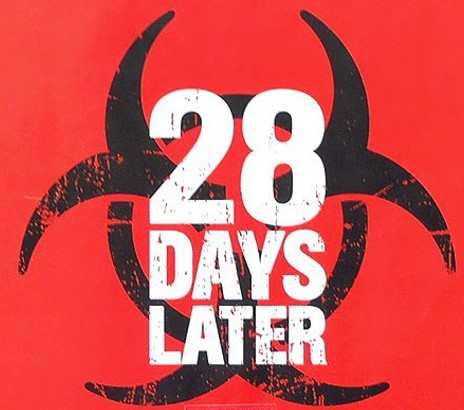
A third convention that we followed is a logo/symbol the audience can remember the film poster by, which is the bio hazard symbol.
 |
We used this convention as it it will be the first thing that the audience would recognize, and it also acts as a trademark for the film; coming in handy if the film was to turn into a franchise. The idea for the bio hazard symbol came from looking at film posters like Zombie Diaries, and also 28 Days Later and 28 Weeks Later as they're part of a film franchise. Examples of what we used and how we put it into our poster can be seen below.
|
Another important convention that we embodied into our film poster was the use of a Tagline, which most horror posters use to give the audience a small look in to what the film is about and/or what its based on without giving a lot away, to leave room for the imagination.
Our own film tagline is "I'm Dyin' For It" which may give away that our film is based on the zombie subgenre of horror, however it doesnt explain how its a zombie film. "I'm Dyin' For It" allows the audience to imagine and interpret how they want, and may raise questions within them, urging them to watch the film. The tagline is placed in the middle of the poster, inside the main image; most zombie horror film posters put their tagline at the top or at the bottom of the poster - making this a convention that we developed and not just used.
 |
| Our Film Poster |
 |
| Shaun Of The Dead |
 |
| Day Of The Dead |
 |
Dawn Of The Dead
|
A key convention that we incorporated was placing the institutional blurb at the bottom of our poster, which is what all existing horror posters have. Most horror posters user a very slim font to write their institutional blurb, which is a convention that we used. The institutional blurb consists of the cast of the film, writers, producers, costume designers and sound technicians. The institutional blurb is smaller than the rest of the film titles on the poster, as it isnt the main focus of the poster. We decided to write the institutional blurb in black so that it stands out against the background.
 |
| Our Film Poster |
 |
| Zombieland |
 |
Resident Evil
|
 By taking conventions from other zombie horror film posters and adding it to our own, it helped us to develop and create a successful film poster. As we are comparing our own film poster to existing media texts, I've broken down what we used and how we developed it further, making it our own. Doing this effectively means that we fully understand the conventions and concepts of the zombie subgenre in terms of making a film poster.